Advertisements
Advertisements
प्रश्न
For an experiment in Botany, two different plants, plant A and plant B were grown under similar laboratory conditions. Their heights were measured at the end of each week for 3 weeks. The results are shown by the following graph.
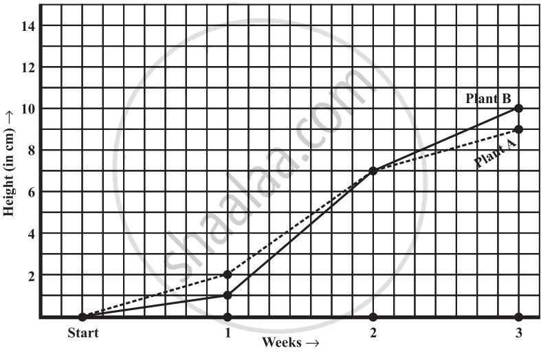
- How high was Plant A after (i) 2 weeks (ii) 3 weeks?
- How high was Plant B after (i) 2 weeks (ii) 3 weeks?
- How much did Plant A grow during the 3rd week?
- How much did Plant B grow from the end of the 2nd week to the end of the 3rd week?
- During which week did Plant A grow most?
- During which week did Plant B grow least?
- Were the two plants of the same height during any week shown here? Specify.
उत्तर
- After 2 weeks, the height of plant A was 7 cm.
- After 3 weeks, the height of plant A was 9 cm.
- After 2 weeks, the height of plant B was 7 cm.
- After 3 weeks, the height of plant B was 10 cm.
-
- Growth of plant A during 3rd week = 9 cm − 7 cm = 2 cm
- Growth of plant B from the end of the 2nd week to the end of the 3rd week
- = 10 cm − 7 cm = 3 cm
- Growth of plant A during 1st week = 2 cm − 0 cm = 2 cm.
- Growth of plant A during 2nd week = 7 cm − 2 cm = 5 cm.
- Growth of plant A during 3rd week = 9 cm − 7 cm = 2 cm
- Therefore, plant A grew the most, i.e. 5 cm, during the 2nd week.
- Growth of plant B during 1st week = 1 cm − 0 cm = 1 cm.
- Growth of plant B during 2nd week = 7 cm − 1 cm = 6 cm.
- Growth of plant B during 3rd week = 10 cm − 7 cm = 3 cm.
- Therefore, plant B grew the least, i.e. 1 cm, during the 1st week.
- At the end of the 2nd week, the heights of both plants were same.
APPEARS IN
संबंधित प्रश्न
Use the tables below to draw linear graphs.
The number of days a hill side city received snow in different years.
| Year | 2003 | 2004 | 2005 | 2006 |
| Days | 8 | 10 | 5 | 12 |
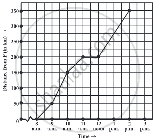
A courier-person cycles from a town to a neighboring suburban area to deliver a parcel to a merchant. His distance from the town at different times is shown by the following graph.
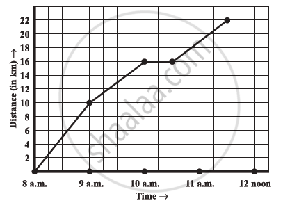
- What is the scale taken for the time axis?
- How much time did the person take for the travel?
- How far is the place of the merchant from the town?
- Did the person stop on his way? Explain.
- During which period did he ride fastest?
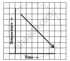
Can there be a time-temperature graph as follows? Justify your answer.
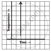
Can there be a time-temperature graph as follows? Justify your answer.
The following table shows the number of patients discharged from a hospital with HIV diagnosis in different years:
| Years: | 2002 | 2003 | 2004 | 2005 | 2006 |
| Number of patients: | 150 | 170 | 195 | 225 | 230 |
Represent this information by a graph.
The following table shows the sales of a commodity during the years 2000 to 2006.
| Years: | 2000 | 2001 | 2002 | 2003 | 2004 | 2005 | 2006 |
| Sales (in lakhs of Rs): | 1.5 | 1.8 | 2.4 | 3.2 | 5.4 | 7.8 | 8.6 |
Draw a graph of this information.
Draw the temperature-time graph in each of the following cases:
| Time (in hours): | 8:00 | 10:00 | 12:00 | 14:00 | 16:00 | 18:00 | 20:00 |
| Temperature (°F) in: | 100 | 101 | 104 | 103 | 99 | 98 | 100 |
Study the given graph and complete the corresponding table below.

As part of his science project, Prithvi was supposed to record the temperature every hour one Saturday from 6 am to midnight. At noon, he was taking lunch and forgot to record the temperature. At 8:00 pm, his favourite show came on and so forgot again. He recorded the data so collected on a graph sheet as shown below.
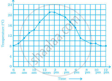
- Why does it make sense to connect the points in this situation?
- Describe the overall trend, or pattern, in the way the temperature changes over the time period shown on the graph.
- Estimate the temperature at noon and 8 pm.
