Advertisements
Advertisements
प्रश्न
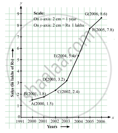
The following table shows the sales of a commodity during the years 2000 to 2006.
| Years: | 2000 | 2001 | 2002 | 2003 | 2004 | 2005 | 2006 |
| Sales (in lakhs of Rs): | 1.5 | 1.8 | 2.4 | 3.2 | 5.4 | 7.8 | 8.6 |
Draw a graph of this information.
उत्तर
Here, year is an independent variable and sales is a dependent variable. So, we take year on the x-axis and sales on the y-axis.
Let us choose the following scale:
On x-axis: 2 cm = 1 year
On y-axis: 2 cm = 1 lakh rupees
Assume that on x-axis, origin (O) represents 1991.
So, the coordinates of O are (1991,0).
Now, let us plot (2000, 1.5), (2001, 1.8), (2002, 2.4), (2003, 3.2), (2004, 5.4), (2005, 7.8) and (2006, 8.6). These points are joined to get the graph representing the given information as shown in the figure below.
APPEARS IN
संबंधित प्रश्न
The following graph shows the temperature of a patient in a hospital, recorded every hour.
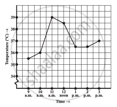
- What was the patient’s temperature at 1 p.m.?
- When was the patient’s temperature 38.5°C?
- The patient’s temperature was the same two times during the period given. What were these two times?
- What was the temperature at 1.30 p.m.? How did you arrive at your answer?
- During which periods did the patients’ temperature showed an upward trend?
For an experiment in Botany, two different plants, plant A and plant B were grown under similar laboratory conditions. Their heights were measured at the end of each week for 3 weeks. The results are shown by the following graph.
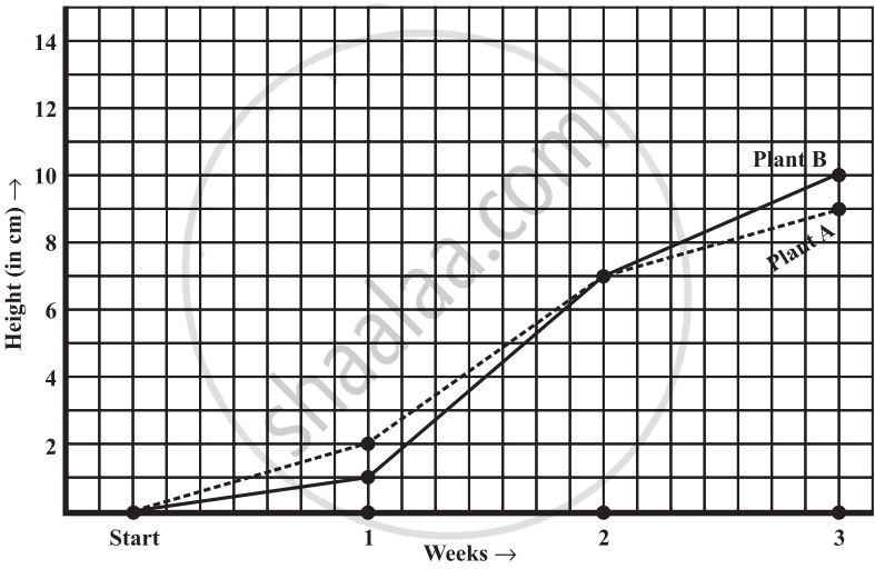
- How high was Plant A after (i) 2 weeks (ii) 3 weeks?
- How high was Plant B after (i) 2 weeks (ii) 3 weeks?
- How much did Plant A grow during the 3rd week?
- How much did Plant B grow from the end of the 2nd week to the end of the 3rd week?
- During which week did Plant A grow most?
- During which week did Plant B grow least?
- Were the two plants of the same height during any week shown here? Specify.
Use the tables below to draw linear graphs.
Population (in thousands) of men and women in a village in different years.
| Year | 2003 | 2004 | 2005 | 2006 | 2007 |
| Number of men | 12 | 12.5 | 13 | 13.2 | 13.5 |
| Number of women | 11.3 | 11.9 | 13 | 13.6 | 12.8 |
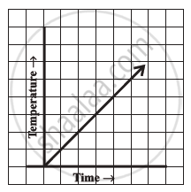
Can there be a time-temperature graph as follows? Justify your answer.
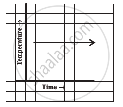
Can there be a time-temperature graph as follows? Justify your answer.
The following table shows the number of patients discharged from a hospital with HIV diagnosis in different years:
| Years: | 2002 | 2003 | 2004 | 2005 | 2006 |
| Number of patients: | 150 | 170 | 195 | 225 | 230 |
Represent this information by a graph.
Draw the temperature-time graph in each of the following cases:
| Time (in hours): | 7:00 | 9:00 | 11:00 | 13:00 | 15:00 | 17:00 | 19:00 | 21:00 |
| Temperature (°F) in: | 100 | 101 | 104 | 102 | 100 | 99 | 100 | 98 |
A graph that displays data that changes continuously over periods of time is ______.
Study the given graph and complete the corresponding table below.

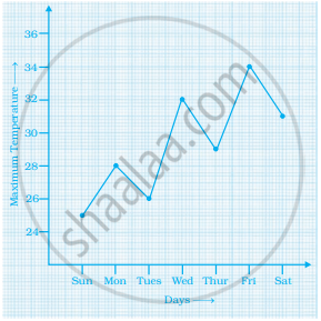
Study the graph and answer the questions that follow.
- What information does the graph give?
- On which day was the temperature the least?
- On which day was the temperature 31°C?
- Which was the hottest day?