Advertisements
Advertisements
प्रश्न
Explain in detail the types of pyplots using Matplotlib.
उत्तर
Matplotlib allows us to create different kinds of plots ranging from histograms and scatter plots to bar graphs and bar charts.
Line Chart:
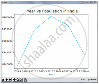
- A-Line Chart or Line Graph is a type of chart that displays information as a series of data points called ‘markers’ connected by straight line segments.
- A-Line Chart is often used to visualize a trend in data over intervals of time – a time series – thus the line is often drawn chronologically.
Program for Line plot:
import matplotlib.pyplot as pit years = [2014, 2015, 2016, 2017, 2018] total_populations = [8939007, 8954518,, 8960387,8956741,8943721]
plt. plot (“years, total_populations)
plt. title (“Year vs Population in India”)
plt.xlabel (“Year”)
plt.ylabel (“Total Population”)
plt.showt
In this program,
Plt.titlet() →→7 specifies title to the graph
Plt.xlabelt) →→ specifies label for X-axis
Plt.ylabelO →→ specifies label for Y-axis
Output:

Bar Chart:
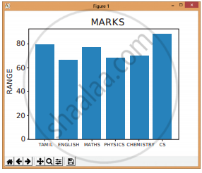
- A BarPlot (or Bar Chart) is one of. the most common type of plot. It shows the relationship between a numerical variable and a categorical variable.
- The bar chart represents categorical data with rectangular bars. Each bar has a height that corresponds to the value it represents.
- The bars can be plotted vertically or horizontally.
- It is useful when we want to compare a given numeric value on different categories.
- To make a bar chart with Matplotlib, we can use the plt.bart) function.
Program:
import matplotlib.pyplot as pit
# Our data
labels = [“TAMIL”, “ENGLISH”, “MATHS”, “PHYSICS”, “CHEMISTRY”, “CS”]
usage = [79.8,67.3,77.8,68.4,70.2,88.5]
# Generating the y positions. Later, we’ll use them to replace them with labels. y_positions = range (len(labels))
# Creating our bar plot
plt.bar (y_positions, usage)
plt.xticks (y_positions, labels)
plt.ylabel (“RANGE”)
pit.title (“MARKS”)
plt.show()
Output:

Pie Chart:
- Pie Chart is probably one of the most common types of charts.
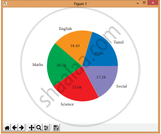
- It is a circular graphic that is divided into slices to illustrate numerical proportion.
- The point of a pie chart is to show the relationship of parts out of a whole.
- To make a Pie Chart with Matplotlib, we can use the plt.pie () function.
- The autopct parameter allows us to display the percentage value using the Python string formatting.
Program:
import matplotlib.pyplot as pit
sizes = [89, 80, 90,100, 75]
labels = [“Tamil”, “English”, “Maths”,
“Science”, “Social”]
plt.pie (sizes, labels = labels,
autopct = “%.2f”)
plt.axesfj.set aspect (“equal”)
plt.showt()
Output:

APPEARS IN
संबंधित प्रश्न
Explain the various buttons in a matplotlib window.
Write the difference between the following functions: plt.plot([1,2,3,4]), plt.plot([1,2,3,4], [1,4,9,16]).
Observe the output figure. Identify the coding for obtaining this output.

Read the code:
a. import matplotlib.pyplot as plt
b. plt.plot(3,2)
c. plt.show()
Identify the output for the above coding.
Read the statements given below. Identify the right option from the following pie chart.
Statement A: To make a pie chart with Matplotlib, we can use the plt.pie() function.
Statement B: The autopct parameter allows us to display the percentage value using the Python string formatting.
Identify the right type of chart using the following hints.
Hint 1: This chart is often used to visualize a trend in data over intervals of time.
Hint 2: The line in this type of chart is often drawn chronologically.
