Advertisements
Advertisements
Question
A paint company asked a group of students about their favourite colours and made a pie chart of their findings. Use the information to answer the following questions.
How many students did not like red colour?
Solution
| Class Intervals | Tally Marks | Frequency |
| 150 − 200 | II | 2 |
| 200 − 250 | III | 3 |
| 250 − 300 | IIII I | 6 |
| 300 − 350 | IIII | 5 |
| 350 − 400 | IIII II | 7 |
| 400 − 450 | IIII | 4 |
| 450 − 500 | III | 3 |
| Total | 30 | |
Total percentage of students = 100%
∴ 50 students = 100% – (30% + 20% + 25% + 15%)
= 100% – 90%
50 students = 10%
10% of total students = 50
∴ `10/100` (Total students) = 50
Total students = `(50 xx 100)/10` = 500
Total students = 500.
Percentage of students liked red colour
= 20%
Percentage of students did not like red colour
= 100% – 20%
= 80%
∴ Number of students did not like red colour
= 80% of 500
= `80/100 xx 500`
= 400
400 students did not like red colour.
APPEARS IN
RELATED QUESTIONS
Media and business people use pie charts
A paint company asked a group of students about their favourite colours and made a pie chart of their findings. Use the information to answer the following questions.
What percentage of the students like red colour?
A paint company asked a group of students about their favourite colours and made a pie chart of their findings. Use the information to answer the following questions.
How many students liked green colour?
A paint company asked a group of students about their favourite colours and made a pie chart of their findings. Use the information to answer the following questions.
What fraction of the students liked blue?
A paint company asked a group of students about their favourite colours and made a pie chart of their findings. Use the information to answer the following questions.
How many students liked pink or blue?
A paint company asked a group of students about their favourite colours and made a pie chart of their findings. Use the information to answer the following questions.
How many students were asked about their favourite colours?
Income from various sources for Government of India from a rupee is given below. raw a pie chart.
| Source | Corporation tax | Income tax | Customs | Excise duties | Service Tax | Others |
| Income (in paise) | 19 | 16 | 9 | 14 | 10 | 32 |
The data on modes of transport used by the students to come to school are given below. Draw a pie chart for the data
| Mode of transport | Bus | Cycle | Walking | Scooter | Car |
| Percentage of students | 40% | 30% | 15% | 10% | 5% |
The following table shows the percentage of demand of different plants.
| Plants | Rose | Lily | Tulip | Daisy | Dahlia |
| No. of Plants | 31 | 25 | 12 | 17 | 15 |
Complete the following table:
| Plants | No. of plants | Measure of central angle |
| Rose | 31 | `31/100 xx 360^circ = square` |
| Lily | 25 | `square` |
| Tulip | 12 | `square` |
| Daisy | 17 | `square` |
| Dahlia | 15 | `square` |
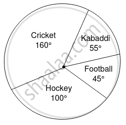
In the given figure, the pie diagram represents the amount spent on different sports by a school administration in a year. If the money spent on football is ₹ 9,000, answer the following questions:

- What is the total amount spent on sports?
- What is the amount spent on cricket?
