Advertisements
Advertisements
Question
In the given figure, the pie diagram represents the amount spent on different sports by a school administration in a year. If the money spent on football is ₹ 9,000, answer the following questions:
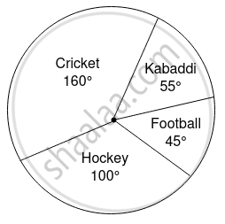
- What is the total amount spent on sports?
- What is the amount spent on cricket?
Solution
a Let total amount spent on sports be x.
Central angle for football = 45°
Amount spent on football = 9,000
`"Central angle" = ("Amount spent on football" xx 360)/"Total amount spent on sports"`
`45 = (9,000 xx 360)/45`
x = 200 × 360
x = 72,000
Total amount spent on sports is 72,000.
b. Let amount spent on cricket by y.
Central angle for cricket = 160°
Total amount spent on sports = ₹72,000
`"Central angle" = "Amount spent on cricket"/"Total amount spent on sports" xx 360`
`160 = y/72000 xx 360`
`y = (160 xx 72000)/360`
y = ₹32,000
Amount spent on cricket is ₹32,000
APPEARS IN
RELATED QUESTIONS
Pie chart is a __________ graph
Comparison of parts of a whole may be done by a pie chart
A paint company asked a group of students about their favourite colours and made a pie chart of their findings. Use the information to answer the following questions.
What percentage of the students like red colour?
A paint company asked a group of students about their favourite colours and made a pie chart of their findings. Use the information to answer the following questions.
How many students liked green colour?
A paint company asked a group of students about their favourite colours and made a pie chart of their findings. Use the information to answer the following questions.
How many students did not like red colour?
A paint company asked a group of students about their favourite colours and made a pie chart of their findings. Use the information to answer the following questions.
How many students liked pink or blue?
A paint company asked a group of students about their favourite colours and made a pie chart of their findings. Use the information to answer the following questions.
How many students were asked about their favourite colours?
Draw a pie chart for the given table
| Continent | Asia | Africa | North America | South America | Europe | Australia | Antarctica |
| Area | 30% | 20% | 16% | 12% | 7% | 6% | 9% |
The data on modes of transport used by the students to come to school are given below. Draw a pie chart for the data
| Mode of transport | Bus | Cycle | Walking | Scooter | Car |
| Percentage of students | 40% | 30% | 15% | 10% | 5% |
The following table shows the percentage of demand of different plants.
| Plants | Rose | Lily | Tulip | Daisy | Dahlia |
| No. of Plants | 31 | 25 | 12 | 17 | 15 |
Complete the following table:
| Plants | No. of plants | Measure of central angle |
| Rose | 31 | `31/100 xx 360^circ = square` |
| Lily | 25 | `square` |
| Tulip | 12 | `square` |
| Daisy | 17 | `square` |
| Dahlia | 15 | `square` |
