Advertisements
Advertisements
Question
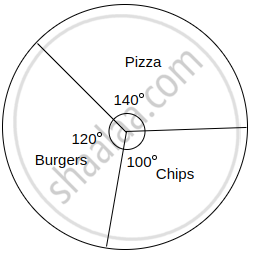
A survey was conducted for 180 people in a city. 70 ate Pizza, 60 ate burgers and 50 ate chips. Draw a pie diagram for the given information.
Solution
Total number of people = 180
Converting the number of people who prefer various food items into components part of 360°
Central angle of a component = `"Value of the component"/"Total value" xx 360^circ`
| Items | No. of people | Central angle |
| Pizza | 70 | `70/180 xx 360^circ = 140^circ` |
| Burgers | 60 | `60/180 xx 360^circ = 120^circ` |
| Chips | 50 | `50/180 xx 360^circ = 100^circ` |
| Total | 180 | 360° |
Food items preferred by people:
APPEARS IN
RELATED QUESTIONS
Pie chart is a __________ graph
Comparison of parts of a whole may be done by a pie chart
A pie diagram is a circle broken down into component sectors
Media and business people use pie charts
A paint company asked a group of students about their favourite colours and made a pie chart of their findings. Use the information to answer the following questions.
What percentage of the students like red colour?
A paint company asked a group of students about their favourite colours and made a pie chart of their findings. Use the information to answer the following questions.
How many students liked green colour?
A paint company asked a group of students about their favourite colours and made a pie chart of their findings. Use the information to answer the following questions.
What fraction of the students liked blue?
A paint company asked a group of students about their favourite colours and made a pie chart of their findings. Use the information to answer the following questions.
How many students did not like red colour?
A paint company asked a group of students about their favourite colours and made a pie chart of their findings. Use the information to answer the following questions.
How many students liked pink or blue?
A paint company asked a group of students about their favourite colours and made a pie chart of their findings. Use the information to answer the following questions.
How many students were asked about their favourite colours?
A survey gives the following information of food items preferred by people. Draw a Pie chart.
| Items | Vegetables | Meat | Salad | Fruits | Sprouts | Bread |
| No. of people | 160 | 90 | 80 | 50 | 30 | 40 |
Income from various sources for Government of India from a rupee is given below. raw a pie chart.
| Source | Corporation tax | Income tax | Customs | Excise duties | Service Tax | Others |
| Income (in paise) | 19 | 16 | 9 | 14 | 10 | 32 |
Monthly expenditure of Kumaran’s family is given below. Draw a suitable Pie chart.
| Particulars | Food | Education | Rent | Transport | Miscellaneous |
| Expenses (in %) | 50% | 20% | 15% | 5% | 10% |
Also
1. Find the amount spent for education if Kumaran spends ₹ 6000 for Rent.
2. What is the total salary of Kumaran?
3. How much did he spend more for food than education?
Draw a pie chart for the given table
| Continent | Asia | Africa | North America | South America | Europe | Australia | Antarctica |
| Area | 30% | 20% | 16% | 12% | 7% | 6% | 9% |
The data on modes of transport used by the students to come to school are given below. Draw a pie chart for the data
| Mode of transport | Bus | Cycle | Walking | Scooter | Car |
| Percentage of students | 40% | 30% | 15% | 10% | 5% |
In the pie-diagram, the data of 720 students who opted for their favourite literature type is shown. The data is expressed in the percentages. Using this diagram complete the following table.
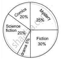
| Type of Literature | Angular measure | Number of students |
| Comics | 72° | 144 |
| Mystery | 90° | ______ |
| Fiction | ______ | 216 |
| Drama | ______ | ______ |
| Science Fiction | 72° | 144 |
In the given figure, the pie diagram represents the amount spent on different sports by a school administration in a year. If the money spent on football is ₹ 9,000, answer the following questions:
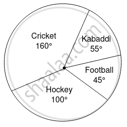
- What is the total amount spent on sports?
- What is the amount spent on cricket?
