Advertisements
Advertisements
Question
The following table gives the distribution of IQ's (intelligence quotients) of 60 pupils of class V in a school:
| IQ's: | 125.5 to 13.25 |
118.5 to 125.5 |
111.5 to 118.5 |
104.5 to 111.5 |
97.5 to 104.5 |
90.5 to 97.5 |
83.5 to 90.5 |
76.5 to 83.5 |
69.5 to 76.5 |
62.5 to 69.5 |
| No. of pupils: |
1 | 3 | 4 | 6 | 10 | 12 | 15 | 5 | 3 | 1 |
Draw a frequency polygon for the above data.
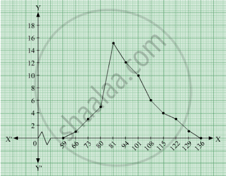
Solution 1
We first draw horizontal and vertical axes. Let us consider that the horizontal and vertical axes represent the class-limits and the frequencies of the class-intervals respectively.
The given data is a continuous grouped frequency distribution with equal class-intervals. To draw the frequency polygon of the given data without using histogram, obtain the class-limits of the class intervals. Obtain the class-limits of two class-intervals of 0 frequencies, i.e. on the horizontal axis, one adjacent to the first, on its left and one adjacent to the last, on its right. These class-intervals are known as imagined class-intervals. Then plot the frequencies against class-limits.
The following table is useful to draw the frequency polygon of the given data.
| Class - Intervals | Class - Marks | Frequency |
| 55.5-62.5 | 59 | 0 |
| 62.5-69.5 | ||
We represent class marks on X-axis on a suitable scale and the frequencies on Y-axis on a suitable scale.
To obtain the frequency polygon we plot the points (66, 1), (73, 3), (80, 5), (87, 15), (94, 12), (101, 10), (108, 6), (115, 4), (122, 3), (129, 1).
Now we join the plotted points by line segments. The end points (66, 1) and (129, 1) are joined to the mid points (59, 0) and ( 136, 0) respectively of imagined class intervals to obtain the frequency polygon.
Solution 2
We first draw horizontal and vertical axes. Let us consider that the horizontal and vertical axes represent the class-limits and the frequencies of the class-intervals respectively.
The given data is a continuous grouped frequency distribution with equal class-intervals. To draw the frequency polygon of the given data without using histogram, obtain the class-limits of the class intervals. Obtain the class-limits of two class-intervals of 0 frequencies, i.e. on the horizontal axis, one adjacent to the first, on its left and one adjacent to the last, on its right. These class-intervals are known as imagined class-intervals. Then plot the frequencies against class-limits.
The following table is useful to draw the frequency polygon of the given data.
| Class - Intervals | Class - Marks | Frequency |
| 55.5-62.5 | 59 | 0 |
| 62.5-69.5 | 66 | 1 |
| 69.5 - 76.5 | 73 | 3 |
| 76.5 - 83.5 | 80 | 5 |
| 83.5 - 90.5 | 87 | 15 |
| 90.5 - 97.5 | 94 | 12 |
| 97.5-104.5 | 101 | 10 |
| 104-111.5 | 108 | 6 |
| 111.5 - 118.5 | 115 | 4 |
| 118.5-125.5 | 122 | 3 |
| 125.5-132.5 | 129 | 1 |
| 132.5-139.5 | 136 | 0 |
We represent class marks on X-axis on a suitable scale and the frequencies on Y-axis on a suitable scale.
To obtain the frequency polygon we plot the points (66, 1), (73, 3), (80, 5), (87, 15), (94, 12), (101, 10), (108, 6), (115, 4), (122, 3), (129, 1).
Now we join the plotted points by line segments. The end points (66, 1) and (129, 1) are joined to the mid points (59, 0) and ( 136, 0) respectively of imagined class intervals to obtain the frequency polygon.
APPEARS IN
RELATED QUESTIONS
Study the bar graph representing the number of persons in various age groups in a town shown in Fig. below. Observe the bar graph and answer the following questions:
(i) What is the percentage of the youngest age-group persons over those in the oldest age group?
(ii) What is the total population of the town?
(iii) What is the number of persons in the age group 60 - 65?
(iv) How many persons are more in the age-group 10 - 15 than in the age group 30 - 35?
(v) What is the age-group of exactly 1200 persons living in the town?
(vi) What is the total number of persons living in the town in the age-group 50 - 55?
(vii) What is the total number of persons living in the town in the age-groups 10 - 15 and 60 - 65?
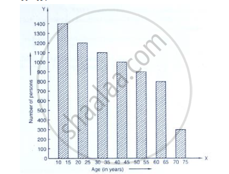
(viii) Whether the population in general increases, decreases or remains constant with the increase in the age-group.
Given below (Fig. below) is the bar graph indicating the marks obtained out of 50 in mathematics paper by 100 students. Read the bar graph and answer the following questions:

(i) It is decided to distribute work books on mathematics to the students obtaining less than 20 marks, giving one workbook to each of such students. If a work book
costs Rs 5, what sum is required to buy the work books?
(ii) Every student belonging to the highest mark group is entitled to get a prize of Rs. 10. How much amount of money is required for distributing the prize money?
(iii) Every student belonging to the lowest mark—group has to solve 5 problems per day. How many problems, in all, will be solved by the students of this group per day?
(iv) State whether true or false.
a. 17% students have obtained marks ranging from 40 to 49.
b. 59 students have obtained marks ranging from 10 to 29.
(v) What is the number of students getting less than 20 marks?
(vi) What is the number of students getting more than 29 marks?
(vii) What is the number of students getting marks between 9 and 40?
(viii) What is the number of students belonging to the highest mark group?
(ix) What is the number of students obtaining more than 19 marks?
Read the bar graph given in Fig. below and answer the following questions:
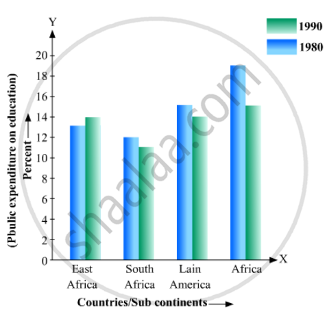
(i) What information does it give?
(ii) In which part the expenditure on education is maximum in 1980?
(iii) In which part the expenditure has gone up from 1980 to 1990?
(iv) In which part the gap between 1980 and 1990 is maximum?
Read the following bar graph and answer the following questions:
(i) What information is given by the bar graph?
(ii) In which year the export is minimum?
(iii)In which year the import is maximum?
(iv)In which year the difference of the values of export and import is maximum?

The following table shows the number of Maruti cars sold by five dealers in a particular month:
| Dealer: | Saya | Bagga Links | D.D. Motors | Bhasin Motors | Competent |
| Cars sold: | 60 | 40 | 20 | 15 | 10 |
Represent the above information by a pictograph.
The production of oil (in lakh tonnes) in some of the refineries in India during 1982 was given below:
| Refinery: | Barauni | Koyali | Mathura | Mumbai | Florida |
| Production of oil (in lakh tonnes) |
30 | 70 | 40 | 45 | 25 |
Construct a bar graph to represent the above data so that the bars are drawn horizontally.
Construct a histogram for the following data:
| Monthly School fee (in Rs): |
30-60 | 60-90 | 90-120 | 120-150 | 150-180 | 180-210 | 210-240 |
| No of Schools | 5 | 12 | 14 | 18 | 10 | 9 | 4 |
Which one of the following is not the graphical representation of statistical data:
Read the following bar graph and answer the following questions: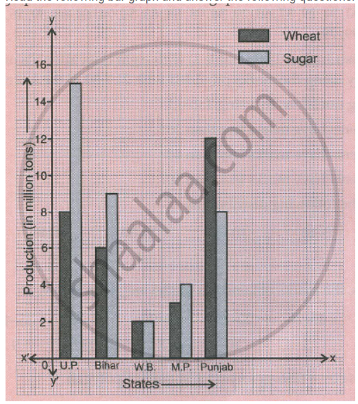
a. What information is given by the graph?
b. Which state is the largest producer of wheat?
c. Which state is the largest producer of sugar?
d. Which state has total production of wheat and sugar as its maximum?
e. Which state has the total production of wheat and sugar minimum?
The lengths of 62 leaves of a plant are measured in millimetres and the data is represented in the following table:
| Length (in mm) | Number of leaves |
| 118 – 126 | 8 |
| 127 – 135 | 10 |
| 136 – 144 | 12 |
| 145 – 153 | 17 |
| 154 – 162 | 7 |
| 163 – 171 | 5 |
| 172 – 180 | 3 |
Draw a histogram to represent the data above.
