Advertisements
Advertisements
प्रश्न
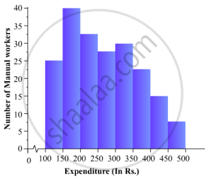
The following is the distribution of total household expenditure (in Rs.) of manual worker in a city:
| Expenditure (in Rs): |
100-150 | 150-200 | 200-250 | 250-300 | 300-350 | 350-400 | 400-450 | 450-500 |
| No. of manual workers: | 25 | 40 | 33 | 28 | 30 | 22 | 16 | 8 |
Draw a histogram and a frequency polygon representing the above data.
उत्तर
To represent the given data by a histogram, we first draw horizontal and vertical axes. Let us consider that the horizontal and vertical axes represent the class-limits and the frequencies of the class-intervals respectively.
The given data is a continuous grouped frequency distribution with equal class-intervals. Construct rectangles with class-intervals as bases and respective frequencies as heights. It should be noted that the scale for horizontal axis may not be same as the scale for vertical axis. To draw the frequency polygon of the given data using histogram, obtain the mid-points of the upper horizontal side of each rectangle and then join these mid-points of the adjacent rectangles of the histogram by line segments. Obtain the mid-points of two class-intervals of 0 frequencies, i.e. on the horizontal axis, one adjacent to the first, on its left and one adjacent to the last, on its right. These class-intervals are known as imagined class-intervals. Complete the polygon by joining the mid-points of first and last class-intervals to the mid-points of imagined class-intervals adjacent to them. Let us take one vertical division is equal to 5 workers.
The heights of the different rectangles are as follows:
1. The height of the rectangle corresponding to the class-interval 100-150 is `25/5=5` big divisions.
2. The height of the rectangle corresponding to the class-interval 150-200 is `40/5=8` big divisions.
3. The height of the rectangle corresponding to the class-interval 200-250 is ` 33/5 = 6.6` big divisions.
4. The height of the rectangle corresponding to the class-interval 250-300 is `28/5 = 5.6 ` big divisions.
5. The height of the rectangle corresponding to the class-interval 300-350 is ` 30/5 =6 ` big divisions.
6. The height of the rectangle corresponding to the class-interval 350-400 is ` 22/5 = 4.4` big divisions.
7. The height of the rectangle corresponding to the class-interval 400-450 is ` 16/5 = 3.2` big division.
8. The height of the rectangle corresponding to the class-interval 450-500 is ` 8/5 = 1.6` big divisions.
The histogram of the given data is as follows:
APPEARS IN
संबंधित प्रश्न
The expenditure (in 10 crores of rupees) on health by the Government of India during the various five year plans is shown below:
| Plans: | I | II | III | IV | V | VI |
| Expenditure on health (in 10 crores of rupees) |
7 | 14 | 23 | 34 | 76 | 182 |
Construct a bar graph to represent the above data.
In a histogram the class intervals or the group are taken along
The percentage of marks obtained, in different subjects by Ashok Sharma (in an examination) is given below. Draw a bar graph to represent it.
| English | Hindi | Maths | Science | Social Studies |
| 85 | 60 | 35 | 50 | 70 |
The birth rate thousand of the following states over a certain period is given below:
| States | Punjab | Haryana | U.P. | Gujarat | Rajasthan | Jammu and Kashmir |
| Birth Rate (per thousand ) | 22.9 | 21.8 | 19.5 | 21.1 | 23.9 | 18.3 |
Draw a bar graph for the above data.
The number of students (boys and girls) of class IX participating in different activities during their annual day function is given below:
| Activities | Dance | Speech | Singing | Quiz | Drama | Anchoring |
| Boys | 12 | 5 | 4 | 4 | 10 | 2 |
| Girls | 10 | 8 | 6 | 3 | 9 | 1 |
Draw a double bar graph for the above data.
Read the following bar graph and answer the following questions: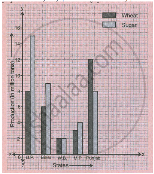
a. What information is given by the graph?
b. Which state is the largest producer of wheat?
c. Which state is the largest producer of sugar?
d. Which state has total production of wheat and sugar as its maximum?
e. Which state has the total production of wheat and sugar minimum?
In a diagnostic test in mathematics given to students, the following marks (out of 100) are recorded:
46, 52, 48, 11, 41, 62, 54, 53, 96, 40, 98, 44
Which ‘average’ will be a good representative of the above data and why?
The expenditure of a family on different heads in a month is given below:
| Head | Food | Education | Clothing | House Rent | Others | Savings |
| Expenditure (in Rs) |
4000 | 2500 | 1000 | 3500 | 2500 | 1500 |
Draw a bar graph to represent the data above.
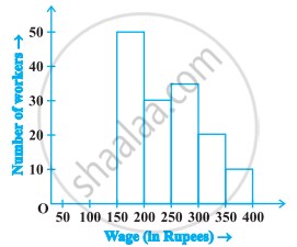
In the following figure, there is a histogram depicting daily wages of workers in a factory. Construct the frequency distribution table.
Following table gives the distribution of students of sections A and B of a class according to the marks obtained by them.
| Section A | Section B | ||
| Marks | Frequency | Marks | Frequency |
| 0 – 15 | 5 | 0 – 15 | 3 |
| 15 – 30 | 12 | 15 – 30 | 16 |
| 30 – 45 | 28 | 30 – 45 | 25 |
| 45 – 60 | 30 | 45 – 60 | 27 |
| 60 –75 | 35 | 60 – 75 | 40 |
| 75 – 90 | 13 | 75 – 90 | 10 |
Represent the marks of the students of both the sections on the same graph by two frequency polygons. What do you observe?
