Topics
Number Systems
Number Systems
Polynomials
Algebra
Coordinate Geometry
Linear Equations in Two Variables
Geometry
Coordinate Geometry
Introduction to Euclid’S Geometry
Mensuration
Statistics and Probability
Lines and Angles
- Introduction to Lines and Angles
- Basic Terms and Definitions
- Intersecting Lines and Non-intersecting Lines
- Introduction to Parallel Lines
- Pairs of Angles
- Parallel Lines and a Transversal
- Angle Sum Property of a Triangle
Triangles
- Concept of Triangles
- Congruence of Triangles
- Criteria for Congruence of Triangles
- Properties of a Triangle
- Some More Criteria for Congruence of Triangles
- Inequalities in a Triangle
Quadrilaterals
- Concept of Quadrilaterals
- Properties of a Quadrilateral
- Types of Quadrilaterals
- Another Condition for a Quadrilateral to Be a Parallelogram
- Theorem of Midpoints of Two Sides of a Triangle
- Property: The Opposite Sides of a Parallelogram Are of Equal Length.
- Theorem: A Diagonal of a Parallelogram Divides It into Two Congruent Triangles.
- Theorem : If Each Pair of Opposite Sides of a Quadrilateral is Equal, Then It is a Parallelogram.
- Property: The Opposite Angles of a Parallelogram Are of Equal Measure.
- Theorem: If in a Quadrilateral, Each Pair of Opposite Angles is Equal, Then It is a Parallelogram.
- Property: The diagonals of a parallelogram bisect each other. (at the point of their intersection)
- Theorem : If the Diagonals of a Quadrilateral Bisect Each Other, Then It is a Parallelogram
Circles
Areas - Heron’S Formula
Surface Areas and Volumes
Statistics
Algebraic Expressions
Algebraic Identities
Area
Constructions
- Introduction of Constructions
- Basic Constructions
- Some Constructions of Triangles
Probability
- Bar graph
- Pie graph
- Histogram
Notes
The representation then becomes easier to understand than the actual data. We shall study the following graphical representations in this section.
(A)Bar graphs
(B) Histograms of uniform width, and of varying widths
(C) Frequency polygons
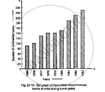
(A) Bar graphs:
A bar graph is a pictorial representation of data in which usually bars of uniform width are drawn with equal spacing between them on one axis (say, the x-axis), depicting the variable. The values of the variable are shown on the other axis (say, the y-axis) and the heights of the bars depend on the values of the variable.
Steps in the process:
1. Decide on a title for your graph.
2. Draw the vertical and horizontal axes.
3.Label the horizontal axes.
4. Write the names of pets where the bars will be.
5. Label the vertical axes.
6. Decide on the scale. Explain that you should consider the least and the greatest number shown on the graph. Discuss what range of numbers should be shown on this bar graph.
7. Draw a bar to show the total for each item.
(B) Histograms :
There are no gaps in between consecutive rectangles, the resultant graph appears like a solid figure. This is called a histogram, which is a graphical representation of a grouped frequency distribution with continuous classes. Also, unlike a bar graph, the width of the bar plays a significant role in its construction.
(C) Frequency polygons:
There is yet another visual way of representing quantitative data and its frequencies. This is a polygon. In frequency polygon are join the midpoints of the upper sides of the adjacent rectangles of this histogram by means of line segments. Although, there exists no class preceding the lowest class and no class succeeding the highest class, addition of the two class intervals with zero frequency enables us to make the area of the frequency polygon the same as the area of the histogram.
Frequency polygons can also be drawn independently without drawing histograms. The mid-points of the class-intervals used in the data. These mid-points of the class-intervals are called class-marks.
To find the class-mark of a class interval, we find the sum of the upper limit and lower limit of a class and divide it by 2. Thus,
Class-mark = `("Upper limit + Lower limit")/2`
Shaalaa.com | Graphical Representation of Data
Related QuestionsVIEW ALL [95]
For the following data, draw a pie graph.
| Subject | Hindi | English | Maths | Science | Social Study |
| Marks as percent | 60 | 45 | 42 | 48 | 75 |
