Advertisements
Advertisements
प्रश्न
Read the following bar graph and answer the following questions:
(i) What information is given by the bar graph?
(ii) In which year the export is minimum?
(iii)In which year the import is maximum?
(iv)In which year the difference of the values of export and import is maximum?

उत्तर
(1) The bar graph represents the import and export (in 100 Crores of rupees) from 1982-83 to 1986-87.
(2) The export is minimum in the year 1982-83 as the height of the bar corresponding to export is minimum in the year 1982-83.
(3) The import is maximum in the year 1986-87 as the height of the bar corresponding to import is maximum in the year 1986-87.
(4) The bars of export and import are side by side. Clearly, it is seen from the bar graph that the difference between the values of export and import is maximum in the year 1986-87.
APPEARS IN
संबंधित प्रश्न
Read the following bar graph and answer the following questions:

(i) What information is given by the bar graph?
(ii) Which state is the largest producer of rice?
(iii) Which state is the largest producer of wheat?
(iv) Which state has total production of rice and wheat as its maximum?
(v) Which state has the total production of wheat and rice minimum?
A frequency polygon is constructed by plotting frequency of the class interval and the
In a histogram the area of each rectangle is proportional to
A histogram is a pictorial representation of the grouped data in which class intervals and frequency are respectively taken along
Draw frequency polygons for each of the following frequency distribution:
(a) using histogram
(b) without using histogram
|
C.I |
5 -15 | 15 -25 | 25 -35 | 35 - 45 | 45-55 | 55-65 |
| ƒ | 8 | 16 | 18 | 14 | 8 | 2 |
Mr. Kapoor compares the prices (in Rs.) of different items at two different shops A and B. Examine the following table carefully and represent the data by a double bar graph.
| Items | Price (in ₹) at the shop A | Price (in ₹) at the shop B |
|
Tea-set |
900 | 950 |
|
Mixie |
700 | 800 |
|
Coffee-maker |
600 | 700 |
|
Dinner set |
600 | 500 |
Manoj appeared for ICSE examination 2018 and secured percentage of marks as shown in the following table:
| Subject | Hindi | English | Maths | Science | Social Study |
| Marks as percent | 60 | 45 | 42 | 48 | 75 |
Represent the above data by drawing a suitable bar graph.
The frequency distribution has been represented graphically as follows:
| Marks | 0 – 20 | 20 – 40 | 40 – 60 | 60 – 100 |
| Number of Students | 10 | 15 | 20 | 25 |
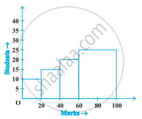
Do you think this representation is correct? Why?
Following table shows a frequency distribution for the speed of cars passing through at a particular spot on a high way:
| Class interval (km/h) | Frequency |
| 30 – 40 | 3 |
| 40 – 50 | 6 |
| 50 – 60 | 25 |
| 60 – 70 | 65 |
| 70 – 80 | 50 |
| 80 – 90 | 28 |
| 90 – 100 | 14 |
Draw the frequency polygon representing the above data without drawing the histogram.
Following table gives the distribution of students of sections A and B of a class according to the marks obtained by them.
| Section A | Section B | ||
| Marks | Frequency | Marks | Frequency |
| 0 – 15 | 5 | 0 – 15 | 3 |
| 15 – 30 | 12 | 15 – 30 | 16 |
| 30 – 45 | 28 | 30 – 45 | 25 |
| 45 – 60 | 30 | 45 – 60 | 27 |
| 60 –75 | 35 | 60 – 75 | 40 |
| 75 – 90 | 13 | 75 – 90 | 10 |
Represent the marks of the students of both the sections on the same graph by two frequency polygons. What do you observe?
