Topics
Rational Numbers
- Rational Numbers
- Closure Property of Rational Numbers
- Commutative Property of Rational Numbers
- Associative Property of Rational Numbers
- Distributive Property of Multiplication Over Addition for Rational Numbers
- Identity of Addition and Multiplication of Rational Numbers
- Negative Or Additive Inverse of Rational Numbers
- Concept of Reciprocal or Multiplicative Inverse
- Rational Numbers on a Number Line
- Rational Numbers Between Two Rational Numbers
Linear Equations in One Variable
- Variable of Equation
- Concept of Equation
- Expressions with Variables
- Balancing an Equation
- The Solution of an Equation
- Linear Equation in One Variable
- Solving Equations Which Have Linear Expressions on One Side and Numbers on the Other Side
- Some Applications Solving Equations Which Have Linear Expressions on One Side and Numbers on the Other Side
- Solving Equations Having the Variable on Both Sides
- Some More Applications on the Basis of Solving Equations Having the Variable on Both Sides
- Reducing Equations to Simpler Form
- Equations Reducible to the Linear Form
Understanding Quadrilaterals
- Concept of Curves
- Different Types of Curves - Closed Curve, Open Curve, Simple Curve.
- Concept of Polygons
- Classification of Polygons
- Properties of a Quadrilateral
- Interior Angles of a Polygon
- Exterior Angles of a Polygon and Its Property
- Concept of Quadrilaterals
- Properties of Trapezium
- Properties of Kite
- Properties of a Parallelogram
- Properties of Rhombus
- Property: The Opposite Sides of a Parallelogram Are of Equal Length.
- Property: The Opposite Angles of a Parallelogram Are of Equal Measure.
- Property: The adjacent angles in a parallelogram are supplementary.
- Property: The diagonals of a parallelogram bisect each other. (at the point of their intersection)
- Property: The diagonals of a rhombus are perpendicular bisectors of one another.
- Property: The Diagonals of a Rectangle Are of Equal Length.
- Properties of Rectangle
- Properties of a Square
- Property: The diagonals of a square are perpendicular bisectors of each other.
Practical Geometry
- Introduction to Geometric Tool
- Constructing a Quadrilateral When the Lengths of Four Sides and a Diagonal Are Given
- Constructing a Quadrilateral When Two Diagonals and Three Sides Are Given
- Constructing a Quadrilateral When Two Adjacent Sides and Three Angles Are Known
- Constructing a Quadrilateral When Three Sides and Two Included Angles Are Given
- Some Special Cases
Data Handling
- Concept of Data Handling
- Interpretation of a Pictograph
- Interpretation of Bar Graphs
- Drawing a Bar Graph
- Interpretation of a Double Bar Graph
- Drawing a Double Bar Graph
- Organisation of Data
- Frequency Distribution Table
- Graphical Representation of Data as Histograms
- Concept of Pie Graph (Or a Circle-graph)
- Interpretation of Pie Diagram
- Chance and Probability - Chance
- Basic Ideas of Probability
Squares and Square Roots
- Concept of Square Number
- Properties of Square Numbers
- Some More Interesting Patterns of Square Number
- Finding the Square of a Number
- Concept of Square Roots
- Finding Square Root Through Repeated Subtraction
- Finding Square Root Through Prime Factorisation
- Finding Square Root by Division Method
- Square Root of Decimal Numbers
- Estimating Square Root
Cubes and Cube Roots
Comparing Quantities
- Concept of Ratio
- Basic Concept of Percentage
- Increase Or Decrease as Percent
- Concept of Discount
- Estimation in Percentages
- Basic Concepts of Profit and Loss
- Sales Tax, Value Added Tax, and Good and Services Tax
- Calculation of Interest
- Concept of Compound Interest
- Deducing a Formula for Compound Interest
- Rate Compounded Annually Or Half Yearly (Semi Annually)
- Applications of Compound Interest Formula
Algebraic Expressions and Identities
- Algebraic Expressions
- Terms, Factors and Coefficients of Expression
- Types of Algebraic Expressions as Monomials, Binomials, Trinomials, and Polynomials
- Like and Unlike Terms
- Addition of Algebraic Expressions
- Subtraction of Algebraic Expressions
- Multiplication of Algebraic Expressions
- Multiplying Monomial by Monomials
- Multiplying a Monomial by a Binomial
- Multiplying a Monomial by a Trinomial
- Multiplying a Binomial by a Binomial
- Multiplying a Binomial by a Trinomial
- Concept of Identity
- Expansion of (a + b)2 = a2 + 2ab + b2
- Expansion of (a - b)2 = a2 - 2ab + b2
- Expansion of (a + b)(a - b) = a2-b2
- Expansion of (x + a)(x + b)
Mensuration
Visualizing Solid Shapes
Exponents and Powers
Direct and Inverse Proportions
Factorization
- Factors and Multiples
- Factorising Algebraic Expressions
- Factorisation by Taking Out Common Factors
- Factorisation by Regrouping Terms
- Factorisation Using Identities
- Factors of the Form (x + a)(x + b)
- Dividing a Monomial by a Monomial
- Dividing a Polynomial by a Monomial
- Dividing a Polynomial by a Polynomial
- Concept of Find the Error
Introduction to Graphs
- Concept of Bar Graph
- Interpretation of Bar Graphs
- Drawing a Bar Graph
- Concept of Double Bar Graph
- Interpretation of a Double Bar Graph
- Drawing a Double Bar Graph
- Concept of Pie Graph (Or a Circle-graph)
- Graphical Representation of Data as Histograms
- Concept of a Line Graph
- Linear Graphs
- Some Application of Linear Graphs
Playing with Numbers
Definition
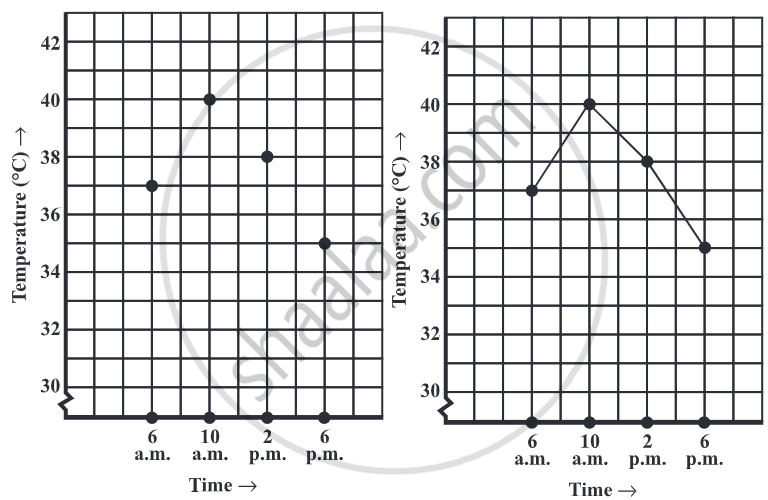
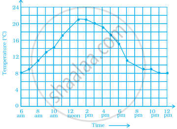
Line graph: A line graph displays data that changes continuously over periods of time.
Notes
Concept of a Line Graph:
A line graph displays data that changes continuously over periods of time.
1. Consider the following data, given in tabular form.
|
Time |
6 a.m. |
10 a.m. |
2 p.m. |
6 p.m. |
| Temperature(°C) |
37 |
40 |
38 |
35 |
-
The horizontal line (usually called the x-axis) shows the timings at which the temperatures were recorded.
-
Temperature(°C) is labelled on the vertical line (usually called the y-axis).
-
By this line graph, we can easily understand the increase and decrease of temperature over the course of 12 hours from 6 AM to 6 PM.
Interpretation of line graph:
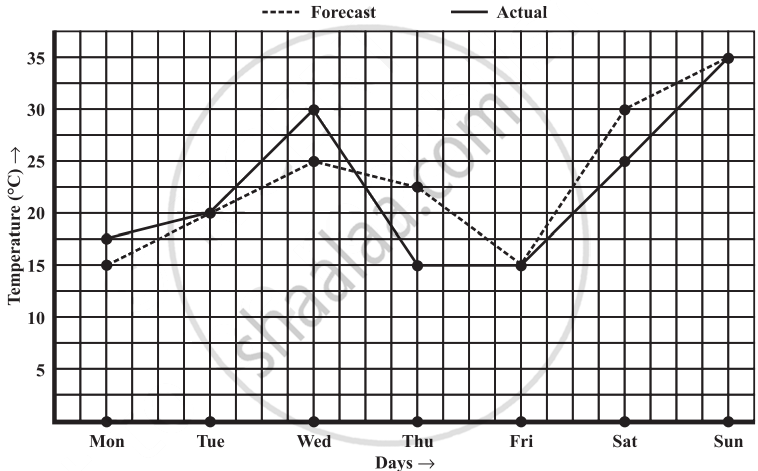
1) The given graph represents the total runs scored by two batsmen A and B, during each of the ten different matches in the year 2007. Study the graph and answer the following questions.
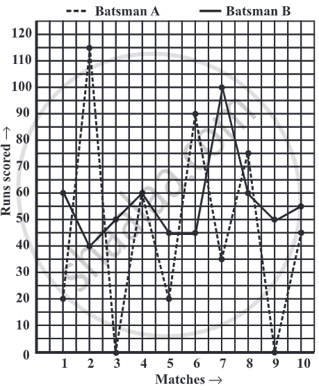
Solution:
Example
Related QuestionsVIEW ALL [33]
Draw the temperature-time graph in each of the following cases:
| Time (in hours): | 8:00 | 10:00 | 12:00 | 14:00 | 16:00 | 18:00 | 20:00 |
| Temperature (°F) in: | 100 | 101 | 104 | 103 | 99 | 98 | 100 |
Draw the temperature-time graph in each of the following cases:
| Time (in hours): | 7:00 | 9:00 | 11:00 | 13:00 | 15:00 | 17:00 | 19:00 | 21:00 |
| Temperature (°F) in: | 100 | 101 | 104 | 102 | 100 | 99 | 100 | 98 |
The runs scored by two teams A and B in first 10 overs are given below:
| Overs: | I | II | III | IV | V | VI | VII | VIII | IX | X |
| Team A: | 2 | 1 | 8 | 9 | 4 | 5 | 6 | 10 | 6 | 2 |
| Team B: | 5 | 6 | 2 | 10 | 5 | 6 | 3 | 4 | 8 | 10 |
Draw a graph depicting the data, making the graphs on the same axes in each case in two different ways as a graph and as a bar chart.
Draw the velocity-time graph from the following data:
| Time (in hours): | 7:00 | 8:00 | 9:00 | 10:00 | 11:00 | 12:00 | 13:00 | 14:00 |
| Speed (in km/hr): | 30 | 45 | 60 | 50 | 70 | 50 | 40 | 45 |
